About / Edition 0.1
Info
About Cool Køge.
A concept demo for a cooler Køge — built by Signal Digital, Køge, in collaboration with The Contentmakers, Berlin.
The idea
Every destination has a brand. visitkoege.dk is the Superbrands® edition: complete, official, dependable. Cool Køge is the CoolBrands® edition: curated, opinionated, built for people who ask an AI where to go before they ask a tourist office.
Six sections — Awesome Places, Business Travel, Curated Escapes, Culture Calendar, Sporting Life, Food Experiences — and one rule: if it is on this site, someone here would actually send you.
The look
Ultramarine, lime, periwinkle. Screen-printed photography, registration marks, data where other sites put adjectives. The design language borrows from the information-dense poster tradition of 1990s record-label graphics, applied to a 738-year-old market town.
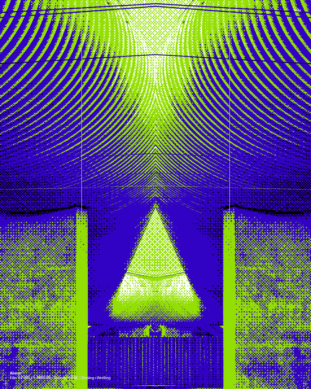
All images on this site are treatments of forty photographs: Køge Nord Station, photographed nine times, Nadia Nadim, once, the Bornholm ferry, once, a restaurant sign on Vestergade, once, two burgers at Halifax, once, a breakfast at Organic Market, once, the Fætter BR sign, once, a Wokshop dining room, once, Køge Å on a market Saturday, once, a pizza at Lillesyd, once, seven Halloween cakes in Lagkagehuset’s shop window, once each, the Irma net, twice — natural and green — two glasses of rosé on the gravel at Gammel Køgegård, once, visitors crossing the lawn to the house in the rhododendron park, once, a pastry chef with a slate of cakes outside her konditori on Nørregade, once, a crate of LPs on a pink chair outside a record shop in a courtyard on Vestergade, once, a plant nursery under polytunnel roofs on Gammel Hastrupvej, twice — the yard and a table of white pumpkins — and a yellow half-timbered house on Brogade with a rooster in the window, once — and two plates, a bistro steak on Jernbanegade and smørrebrød in a courtyard off the square, once each — and four hotels, once each: a beach, a marina, a rooftop pool and a corner of the square. One palette, twenty-nine treatments — see the contact sheet on the front page and the list below.
The people
Signal Digital
Carlsensvej 4
4600 Køge, Denmark
www.signaldigital.com
The Contentmakers
Uhlandstraße 184
10623 Berlin, Germany
www.thecontentmakers.net
Editions: EN · DA · DE · 日本語 · 中文 · 한국어 — in preparation
The treatments
A
Halftone
One disc per cell; its radius is the cell’s darkness. 14–22 px screens.
B
Ordered dither
Bayer 8×8 threshold into three or four palette levels. The house treatment.
C
Pixels
Posterised at 1/8–1/12 resolution, blown back up with hard edges.
D
Line art
Sobel edges only — white on ultramarine, lime on black.
E
Out of register
Three ink plates of the same photo, each printed with its own offset.
F
Mirror / slices
Symmetry from a half; or the frame cut into strips and knocked sideways.
G
Line screen
Gravure: one horizontal line per band, its thickness is the tone. 12–14 px pitch.
H
Echo
The same threshold printed four times, each copy knocked up and sideways — a jump as a motion study.
I
Scan lines
Four levels at 1/10 resolution with every third row blacked out. A paused video.
J
Solarised
Tones above the midpoint flipped negative, then dithered into four flat colours.
K
Split
Part of the frame left exactly as photographed, the rest re-printed — a cut-out of the ship, or a hard seam down the middle. Photo set 04.
L
Negative
Every tone inverted before the dither: a black sign comes out pale, white lettering ultramarine, a cloudy afternoon turns to night. Photo set 05.
M
Mosaic
The frame rebuilt as a wall of flat tiles in a running bond, one colour per tile, a grout line between — the photo’s own subway tiles as the printing screen. Photo set 06.
N
Contour
The tones quantised into eight levels and only the boundaries drawn — a relief map, so latte art becomes a weather chart and the rings of a chopping board finally are the contour lines they always looked like. Photo set 07.
O
Rings
A gravure line screen bent into a target: the tones printed as concentric rings around one point, each ring as thick as the darkness along it. The point is the centre of the sign, so the sign’s own circle is the printing screen. Photo set 08.
P
Weave
Two gravure screens, one vertical and one horizontal, each line as thick as the light along it, crossing over and under cell by cell — a basket weave, printed light on dark. The rattan of the restaurant’s own lamps is the printing screen. Photo set 09.
Q
Ripple
A gravure line screen that waves: horizontal lines, each as thick as the light along it, pushed up and down by a ripple that grows with the depth below the waterline — straight above it, water below it. The river prints the bank the way a river prints. Photo set 10.
R
Wedges
The frame cut into eight slices from one point — the centre of the pizza — and each slice printed as its own gravure line screen: the same pitch, every line as thick as the light along it, but the angle turning 22.5° from one slice to the next, with a thin cut between them. The pizza’s own cuts are the printing screen. Photo set 11.
S
Stipple
A stochastic dot screen: the tones error-diffused onto a coarse grid and every ink cell printed as one round dot, knocked off the grid at random, so the dots scatter like a copperplate stipple engraving — dense where the cake is light, empty where it is dark, nothing where the marble was. Seven cakes cut out and laid out as a specimen sheet, numbered and priced. Photo set 12.
T
Net
A diamond lattice of strands at 45° either way with a knot at every crossing, each strand as thick as the light along it — a hairline in the shadows, a cord on the canvas, solid where the white thread is — printed light on dark, so the bag hangs on the ultramarine the way a string bag would and the packshot’s own background prints as nothing. The Irma net printed as a net. Photo set 13.
U
Leaf
A halftone whose dot is a leaf: the frame cut into cells and every cell printed as one pointed leaf as big as the light in it, the leaves lying along the picture’s own edges where it has them — the slats, the trunks, the roofline — and scattering where it does not, so the park prints through its own canopy. The glasses and the bottle are left exactly as photographed. Photo set 14.
V
Beds
The picture as a garden plan: the frame cut into irregular beds — a Voronoi map, sown thickest where the picture has detail and thinnest on lawn and sky — every bed filled flat with the ink nearest its own colour, outlined in black like a planting plan, the large beds numbered the way the rhododendron society numbers its beds. The visitors are left exactly as photographed. Photo set 15.
W
Piping
A halftone whose dot is a piped rosette — the print of a star nozzle: the frame cut into a honeycomb of cells and every cell printed as one eight-point star with a swirl in it, as big as the light in the cell, white on ultramarine, so the shopfront is iced onto the blue like the top of a cake. The chef and her cakes are left exactly as photographed. Photo set 16.
X
Spines
The frame printed as a crate of records seen end-on: cut into vertical strips of uneven width, 3 to 11 px, every strip keeping its own run of colour down the frame, each colour sent to the nearest of six inks, and every strip pulled up or pushed down a few pixels the way records stand unevenly in a crate, with a dark gap between neighbours. The crate on the chair is left exactly as photographed. Photo set 17.
Y
Seed tray
The frame printed as a plug tray seen from above: cut into a grid of rounded square cells with dark walls between them, every cell filled flat with the ink nearest its own colour — leaves lime, pumpkins red, sky through the roof ice, shade ultramarine, paving periwinkle — and carrying one round plug of soil in its middle, as big as the cell is dark. The autumn table under the roof is left exactly as photographed, cell by cell. Photo set 18.
Z
Timber
The frame printed as a half-timbered wall: cut into bays of uneven width and courses of uneven height by black posts and rails, a brace running corner to corner through some of the bays, and every panel lime-washed flat in the ink nearest its own colour — the ochre façade lime, the tiles red, the sky ice and ultramarine, the cobbles periwinkle. The shop window, the door and the café chairs are left exactly as photographed, panel by panel. Photo set 19.
Æ
Bleu
Two inks only: WordPress’s own duotone filter maps every shadow to ultramarine and every light to pale, in the browser, over a photograph left untouched in the library — the steak frites printed like a blue French menu card. The first treatment made by the site rather than the file. Photo set 20.
Ø
Snaps
The same filter with the other two inks: shadows black, light the red of a house snaps, so the smørrebrød and the dark beer print as a two-colour poster. Photo set 21.
Å
Room service
The duotone filter as a hotel livery: each of the four hotels on Business Travel printed in its own pair of inks — ultramarine and lime for the beach, black and periwinkle for the marina, black and lime for the rooftop pool, ultramarine and white for the square — each hotel page opening on a black band with its slogan in lime capitals, one word to a line. Photo sets 22–25.
Photographs: Rasmus Hjortshøj / COAST Studio, COBE, Dissing+Weitling, HB Køge Women, Bornholmslinjen, Halifax, Organic Market, Martin Warming / sn.dk, Wokshop, Sommerlunds Grill & Italienske Madunivers / herfoelge.com, Lagkagehuset, Coop, Café Åsen, Jens Kirk / Rhododendronforeningen, Martin Rasmussen / sn.dk, Candy Records, Hanen, Martin Haakan / CoverGanda.dk, Frokost MALT, Comwell, Marriott / Four Points Flex, Rox Resort, Centralhotellet — used here for concept demonstration only. Signal Digital’s and The Contentmakers’ own photographs are released under CC BY 4.0.
Cool Køge is a concept demonstration. Edition 0.1, October 2026. Superbrands® and CoolBrands® are trademarks of their respective owners and are used here only to describe a positioning.

